In color analysis, I look at 3 main color attributes: HUE warm/cool, CHROMA bright/soft and VALUE light/dark.
Now it’s time to look at the Chroma.
At Luarg studio, I like to start the draping process with natural-looking ‘lip colors’ to warm up our eyes and avoid shocking the client with extremely colorful drapes right away.
There are 4 of these drapes:
- a soft warm pink
- a brighter warm pink
- a neutral mauve
- and a brighter mauve drape.
Comparing the effects these drapes create on the client’s face is a good start. It can decide whether warm or cool colors suit the client better, and we might be able to see if bright or soft colors are better.
On some people, all of them look good, but sometimes neither is perfect. We look at which one is more harmonious.
For accurate demonstration, my face is 100% makeup-free on these photos. Let’s see the effect of different nude lipsticks + the color drapes.
I put on a honey blonde wig that color-wise looks very natural on me, although it looks light brown because of my light skin as I’m a Light Spring. (At a real color draping session the hair is covered.)
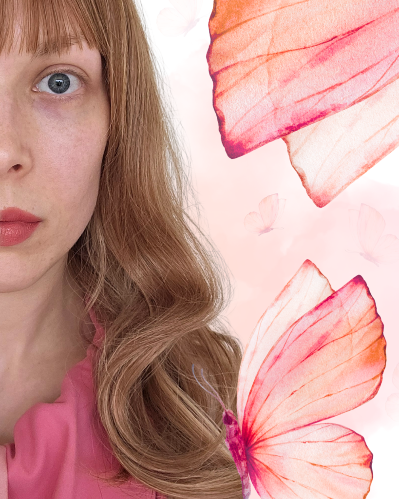
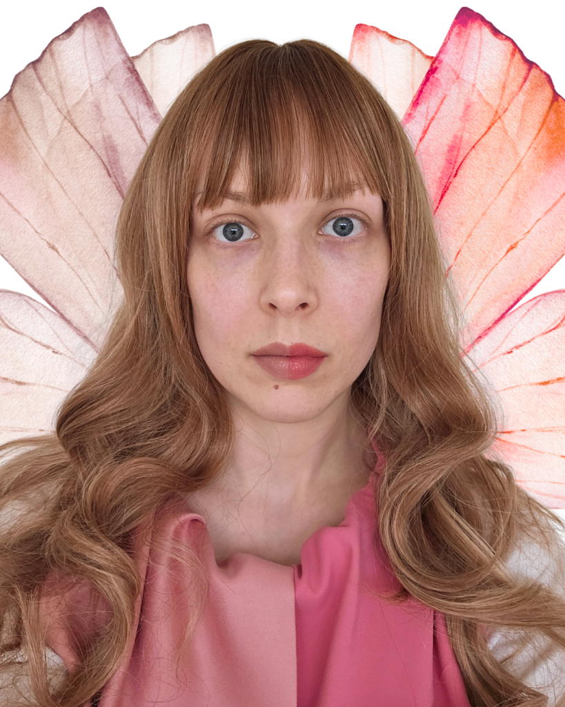
The first photo shows me with a bright warm drape and a warm and bright nude lipstick.
This is the best for me out of the 4 possibilities.

Warm colors: from Soft to Bright
The left side (your left) shows me with a soft warm drape and a soft warm nude lipstick.
I looove soft pinks on me, I would absolutely wear colors similar to this drape.
However, the soft warm lipstick doesn’t do much for my face, compared to the right side with the bright warm drape and the bright nude lipstick.

The bright, warm lippie adds a little life to my face. Even though it looks good on me, the best from these 4 shades, I’m not into nude lipsticks in general. When I want a nude look I don’t bother to apply any makeup on my face.
A lot of people have difficulties finding their perfect nude lipstick. It’s tricky to find it, and color analysis is a huge help in that! I have a carefully selected lipstick collection that contains several nudes. I am proud of creating it after working on it for a long time.
Cool colors: Soft to Bright
Note that the cool color type’s makeup colors should look slightly warmer than the color type’s colors. Otherwise they will be too cool, not harmonious, because everyone, including the cool types, has a skin color that’s somewhere on the orange/yellow part on the color wheel.
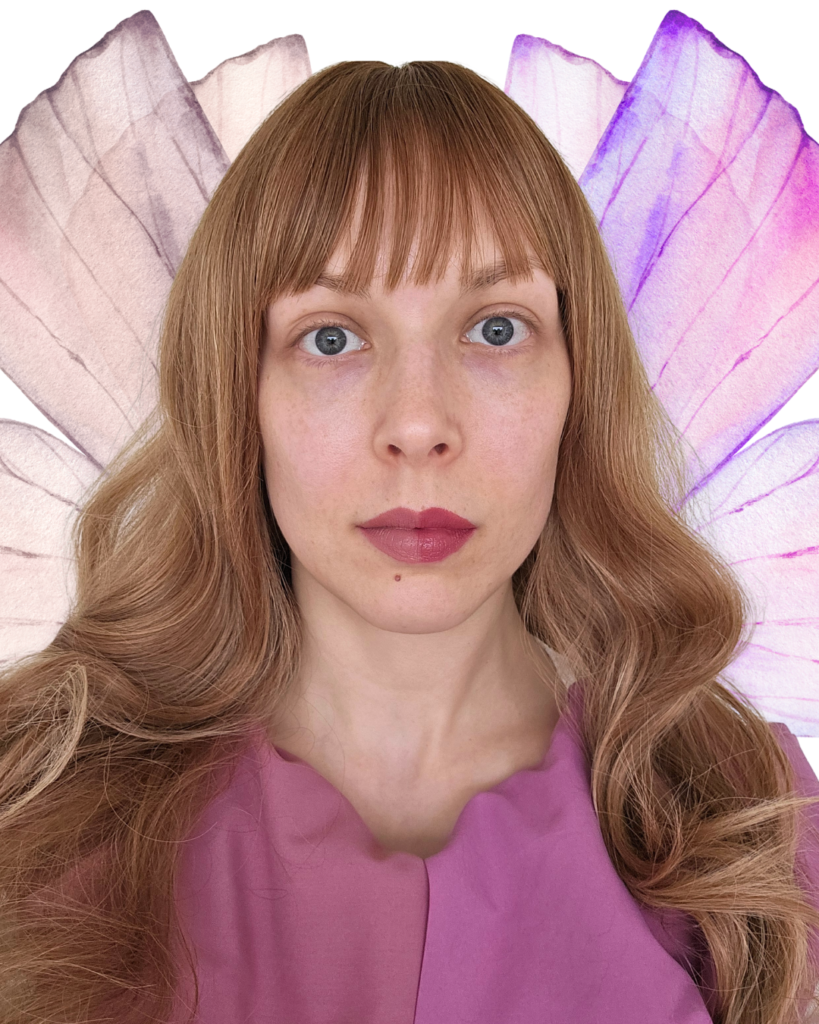
On the left side (your left), I wear a neutral mauve that’s cooler than the previous 2 drapes. It’s not that bad, but compare this to the very first photo.

The right side shows me with a bright cool drape and a lipstick that looks nude on cool and bright types. It doesn’t look nude on me that’s for sure.
Although on me these don’t look harmonious, on cool color types these can look fantastic.
Lipstick swatches on paper and their Color Sensor readings
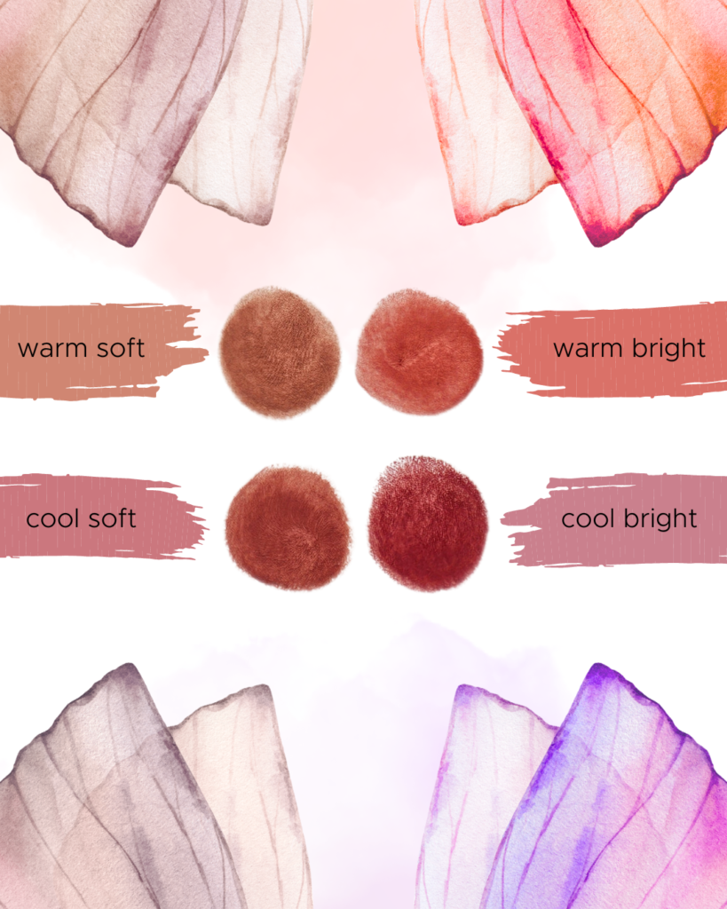
I swatched the four lipstick shades on the same paper and then put my Nix Mini 3 color sensor on them and digitalized the color of the pigments.
The circular shapes are the swatches, and the background of the texts are the digital versions of the readings.
The photographed paper swatches and the digitalized colors don’t look the same. I made paper swatches while creating my lipstick collection so I could compare the exact shades.
Lipsticks look completely different on people even in the same color subtype. My demonstration is only one example of how those lipsticks can look on someone.

Which lipstick adds a little life to my face out of the 4? I think it’s obvious. Can you see it? Don’t worry if not, these differences are the most visible in real life.
Believe me, I tried my best and I figured there’s no point really to dogmatically categorize lipsticks or even drape colors.
Strict rules are only good for preserving outdated clichés and to confuse those who don’t find them helpful.
I see color analysis as a way to make your decisions easier and better. When you know what looks harmonious on you (meaning: you look your best with no work at all) you can decide where and if you want to go somewhere from there. Color analysis tells you the how.

Leave a Reply